⚠️ Affiliate Disclosure: We earn a commission on purchases made via our links — at no extra cost to you.

The Ultimate Guide to CSS Box Shadow Generators in 2026: Enhancing Web Design with Ease

The internet used to be flat. If you remember the early 2000s, websites looked like digital sheets of paper slapped onto a screen. But as we move through 2026, the web has become a 3D environment. We don’t just look at websites anymore; we interact with layers.
Modern UI/UX design relies heavily on depth and dimension. Why? Because humans live in a physical world where shadows tell us what is clickable, what is important, and what is on top of something else. Adding a subtle shadow to a button isn’t just a design choice; it’s a usability feature.
However, writing the code for these shadows manually can be a nightmare. That is where the CSS Box Shadow Generator comes in a tool that bridges the gap between your creative vision and clean, functional code.
What is a CSS Box Shadow Generator?
Simply put, a CSS Box Shadow Generator is a visual tool that allows you to create shadow effects by moving sliders rather than typing lines of code. It gives you a real-time preview of how your element will look on a webpage.
To understand how these tools work, you need to know the language they are translating. A typical box-shadow property looks like this:
box-shadow: 10px 10px 5px 0px rgba(0,0,0,0.75);
Here is the breakdown in plain English:
- H-Offset (Horizontal): Moves the shadow left or right. Positive numbers move it right; negative numbers move it left.
- V-Offset (Vertical): Moves the shadow up or down. Positive is down; negative is up.
- Blur Radius: This decides how blurry the edges are. A higher number means a softer, more natural shadow.
- Spread Radius: This increases the size of the shadow in all directions.
- Color: Usually defined in HEX, RGB, or RGBA.
Why Do You Need a CSS Box Shadow Generator?
I’ve been designing websites for over eight years, and I still use generators. Why? Because trial and error is a productivity killer.
1. Visual Accuracy
It is nearly impossible to visualize exactly how 7px of blur looks compared to 12px without seeing it. A generator lets you fine-tune the softness of a shadow until it feels just right.
2. Time-Saving
Instead of refreshing your browser 50 times to check a code change, you move a slider and copy-paste the final code once. For small business owners managing their own sites, this turns a 20-minute task into a 20-second one.
3. Cross-Browser Compatibility
Good generators provide the vendor prefixes (like -webkit- or -moz-) if needed, ensuring your shadow looks the same on Chrome, Safari, and Firefox.
4. Accessibility for Non-Coders
If you are a marketer or a DIY business owner using a platform like Elementor or Webflow, you might sometimes need a custom extra touch that the built-in settings don’t offer. A generator gives you the exact code to drop into your Custom CSS box.
Common Uses for Box Shadows
Shadows are the secret sauce of Visual Hierarchy. They tell the user’s eye where to look first.
- Buttons: A small shadow makes a button look raised, inviting a click. When the user hovers over it, increasing the shadow can make it feel like the button is lifting toward them.
- Cards: In 2026, Card-based design is everywhere. Shadows separate these content blocks from the background, making the text easier to read.
- Sticky Navbars: When you scroll down a page, a thin shadow under the navigation bar creates a floating effect, signaling that the menu is always accessible.
- Modal Popups: When a discount offer or a newsletter sign-up pops up, a heavy background shadow (often called a drop shadow or overlay) pushes the rest of the site into the background, forcing focus on the popup.
The Psychology of Shadows
From an expert perspective, shadows aren’t just pretty. They are psychological triggers. In my experience, we’ve seen that small changes in elevation can actually impact conversion rates.
The Closer Principle: In human psychology, things that are higher or closer to us are perceived as more important. By using a CSS Box Shadow Generator to lift your Call to Action button higher than other elements, you are subconsciously telling the user: This is the most important thing on the page.
For small businesses, this builds trust. A polished, professional-looking site with proper depth feels more established than a flat, amateur-looking one.
Top 5 CSS Box Shadow Generator Tools for 2026
There are hundreds of tools out there, but these are the ones I keep in my bookmarks:
1. Savenjoy.com
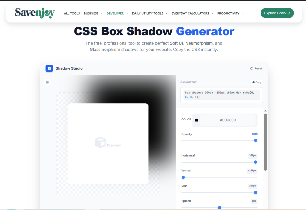
CSS Box Shadow Generator is a professional visual interface designed to create high-end CSS box-shadow effects instantly. It replaces manual coding with an intuitive slider system, allowing you to master modern design trends like Neumorphism and Glassmorphism in seconds. By providing real-time previews and production-ready code, it bridges the gap between creative vision and functional web design.
Pros
- Intuitive live-preview Canvas: Unlike many cluttered tools, Savenjoy offers a massive, distraction-free preview area. You see exactly how your design reacts to depth changes in real-time, which is essential for feeling the UI elevation.
- Precision Control Sliders: It gives you granular control over Opacity and Spread. Two features often buried in other generators. This allows you to create that airy 2026 look rather than heavy, dated shadows.
- One-Click Deployment: The dedicated copy button for the CSS output ensures that even non-coders can grab the code and drop it into WordPress, Elementor, or Webflow without formatting errors.
- Designed for Modern Trends: Specifically optimized for Soft UI, Neumorphism, and Glassmorphism, making it a one-stop-shop for the most popular design styles of this year.
- Zero Learning Curve: The interface is built for speed. You don’t need to be a developer to understand how to use it; if you can move a slider, you can design a high-end website.
Cons
- Focused on Minimalism: Currently, it focuses on single-layer shadows. While this is perfect for 90% of web tasks, advanced designers looking to stack 5+ layers of shadows might find it too streamlined.
- Pro-Level Color Formats: While it handles HEX and RGBA perfectly, it doesn’t yet support the newer OKLCH color space, which some high-end UI purists prefer for perceptual consistency.
- No Inset Toggle: It is currently a master at Drop shadows. For Inset shadows, you might need to adjust the code manually or wait for a future update.
2. CSSmatic
Best For: All-in-one simplicity.
- Pros: Very clean interface; includes border-radius and noise textures.
- Cons: Hasn’t been updated in a while, but it’s a classic that still works perfectly.
3. Box Shadows by Josh Comeau
Best For: High-end, realistic shadows.
- Pros: Uses layered shadows to create incredibly smooth, organic looks that don’t look like gray smudges.
- Cons: Can be a bit technical for absolute beginners.
4. CSS Bud
Best For: Beginners and quick Copy-Paste jobs.
- Pros: Provides a library of pre-made shadows so you don’t even have to move the sliders if you’re in a hurry.
- Cons: Less customization for complex designs.
5. Shadow Palette Generator
Best For: Material Design fans.
- Pros: Follows strict design principles that ensure your site looks professional and correct to the eye.
- Cons: Can feel a bit restrictive if you want to be wild with your design.
Best Practices for 2026: Avoiding the Dirty Shadow
As we move forward in web design, the big, black, muddy shadow is officially dead. Here is how to keep your site looking fresh:
- Avoid Pure Black: Never use rgba(0, 0, 0, 0.5). Instead, use a very dark version of your brand color. For example, if your site is blue, use a dark navy shadow. It looks much cleaner.
- Less is More: If the user notices the shadow immediately, it’s probably too heavy. A shadow should be felt, not seen.
- Core Web Vitals & Performance: While CSS shadows are generally fast, overusing Filter: Drop-shadow or having 100 different shadow types on one page can slow down mobile rendering. Stick to a few elevation levels e.g., Low, Medium, High.
- Layer Your Shadows: Instead of one heavy shadow, use a generator that allows 2 or 3 layers of very light shadows. This mimics how light works in the real world.
Conclusion: Start Adding Depth Today
A CSS Box Shadow Generator is more than just a shortcut; it’s a tool for better communication. It helps you tell your users what matters, creates a professional atmosphere, and saves you hours of tedious coding.
Whether you are building a site for your print shop in Brampton or managing a global affiliate marketing blog, mastering the art of the shadow will put you ahead of the competition.
My advice? Go to one of the tools mentioned above, grab a slider, and see how a little bit of depth can change your entire website’s feel.
Ready to take your design to the next level? Start experimenting with layered shadows today and watch your engagement grow!

Hi, I am Priyanka Roy, an SEO Specialist and Content Writer at Sandhu Marketing Agency Inc.. For the past 4 years, I have been helping businesses improve their websites and grow their organic traffic through practical and effective SEO strategies.
I enjoy working on different SEO tools and exploring how they actually perform in real situations. Over time, I have tested many tools, faced real challenges, and learned what works and what does not. This is exactly what I share on Savenjoy. My goal is to help you understand what to expect from a tool before you spend your money on it.
Instead of just listing features, I focus on real experiences, honest insights, and simple explanations so you can make better decisions with confidence. All I want is to make your journey easier and smarter.
I love trying new digital tools even when I do not need them, just to see if they are worth it or not.